That's my name, wear it out
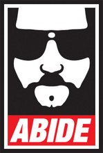
 This is my new personal logo. Now, look at it upside down.
It's called an ambigram.
Here's the backstory:
Back in design school, I had a Grateful Dead decal on my art supply kit. Having just taken a class in Typography, I just loved this decal because of the way the words were designed. If you looked at the words Grateful Dead upside down, it read Grateful Dead. I remember showing the sticker to my Typography teacher and I asked if he'd give me extra credit if I could do something like that. He told me it would depend on the word.
Out of the eventual need for a personal logo when I was to start my job search a year later, and not purely out of self-centeredness, I decided I was gonna try to do my name this way. Piece of cake, I thought. I spelled out my name, then spun the paper around and spelled out the same letters above them, mapping out what the letters have to look like upside down to pull it off.
That's when I spotted the trouble. I wanted DAN FRITSCHIE to read the same when flipped. Flipping a D and making it read E wasn't too difficult, nor was N and H, but making any of the others work was a major pain in the ass. I even tried to simplify the process and make DANIEL read like FRITSCHIE, but making six letters look like nine upside down just made it harder.
Then, I thought I'd make it infinitely easier and just do FRITSCHIE. I stayed up nights doing sketch after sketch and nothing was quite working. The end of the semester quickly came and went, and I gave up on it... Until I was getting ready to graduate. It was laboring on this logo instead of other pieces for my portfolio that was partly to blame for repeating that particular semester. Having to focus on other things, I put it away and chalked it up as my unfinished, albeit deeply frustrating symphony.
Over the years, I revisited the idea, trying it in a variety of styles, from Art deco, to art nouveau, grunge, etc. and I still never got it to work. The F-E combo was simple enough, and it helped that S is right there in the middle. It was the RIT looking like upside down CHI that was the tough nut to crack. Off and on over the next twelve years, I would do a rough sketch or two, promising never to get sucked into it again. If I was gonna be locked in a padded room, it wasn't gonna be over a damned logo!
Then came help from the Illuminati.
The movie Angels and Demons did not interest me at all. Same thing with the DaVinci Code... not my cup of tea. But I went to the Angels and Demons website, and the graphic work there, where they had ambigrams of ILLUMINATI, FIRE, WATER, EARTH, AIR and METAL... all of which, pardon the pun, cracked the code of finishing that damned logo of mine.
A couple dozen sketches later, I had the groundwork for this new logo. A couple of hours messing around in Illustrator, couple of warp filters and viola! Years of intermittent insanity, and it was a Ron Howard movie that made me see the light?!? I guess all there's left to say is: Thanks, Opie!
Might make a neat tattoo, huh?


5 comments:
That's the coolest ambigram I've seen for a long time, and I've seen many. (I design ambigrams, too)
Oh, I have heard of the elusive Grateful Dean ambigram, most say it's from a car sticker/decal. But I have yet to personally see one. How does it look like?
I've tried one The Grateful Dead ambigram on my blog, but would really like to see the 'real' one..
nagfa
singapore
Sorry: Grateful Dead (Grateful Dean would be someone else.)
nagfa
again
Nice job.... however..
click em and weep, click em and weep.
https://www.wowtattoos.com/wow/generator.php
Aw, SONOFABITCH!
love this.
Post a Comment